
A New Mark for a New Chapter
Last year marked ten years of The London Mural Company - a decade of painting walls, shaping spaces, and creating large-scale artistic work across the city and beyond.
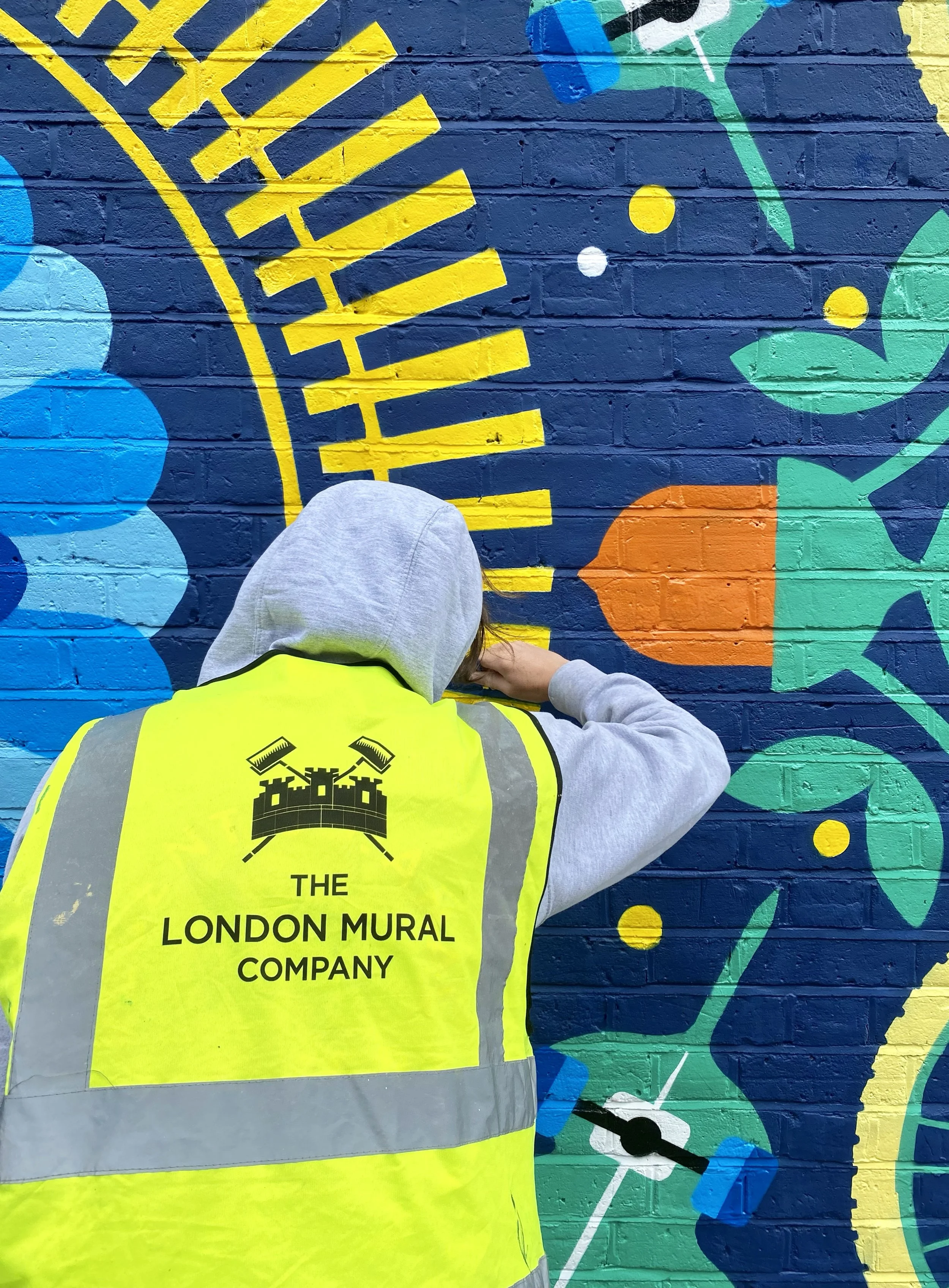
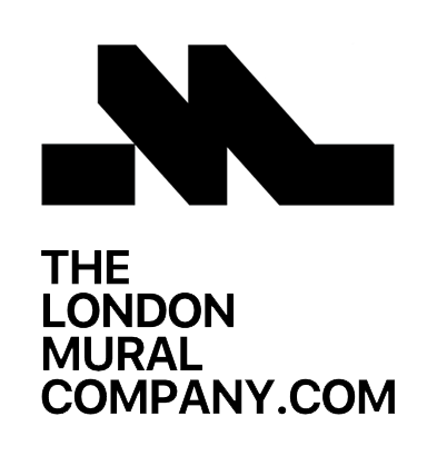
To mark the anniversary, we revisited our visual identity. Our original logo was rooted in the language of traditional craft marks, hand-painted signwriting, and emblem-style design. It reflected our beginnings as painters and our early desire to communicate skill, trust, and permanence.
As the studio has grown, so has the scale and context of our work. We wanted a mark that felt as bold and considered as the environments it appears in.
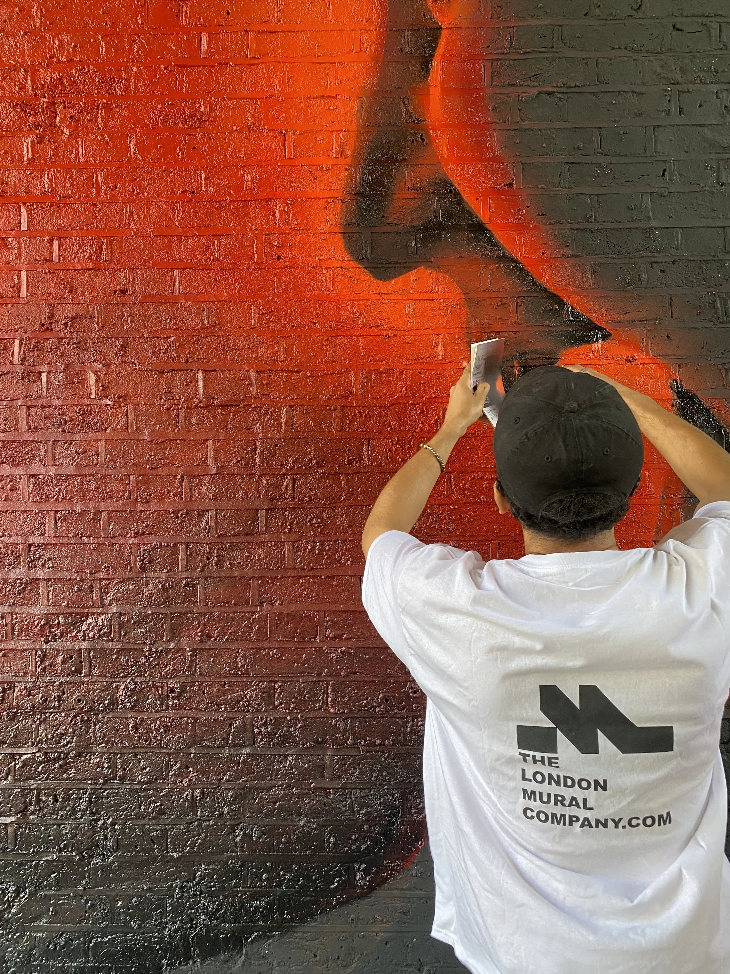
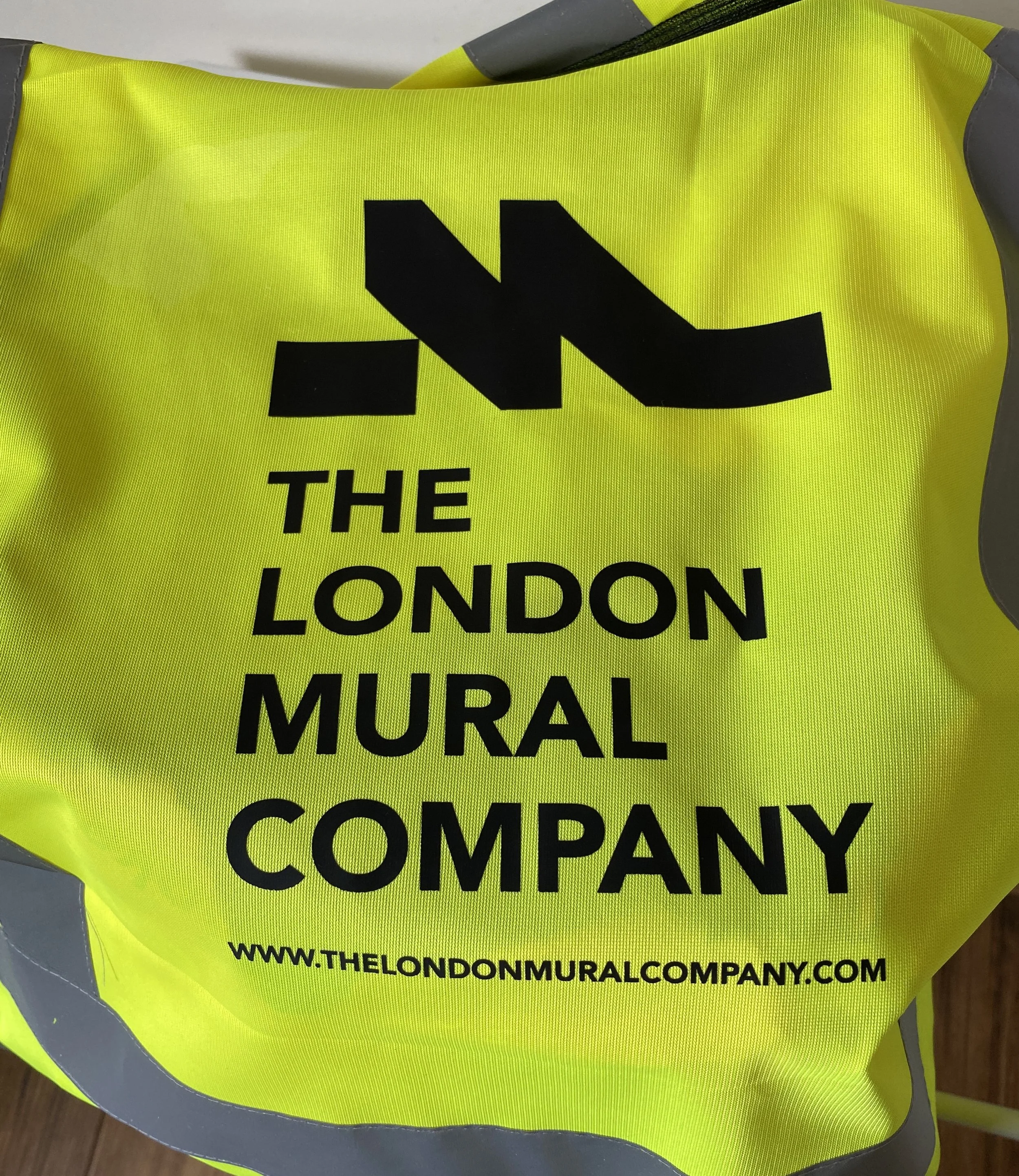
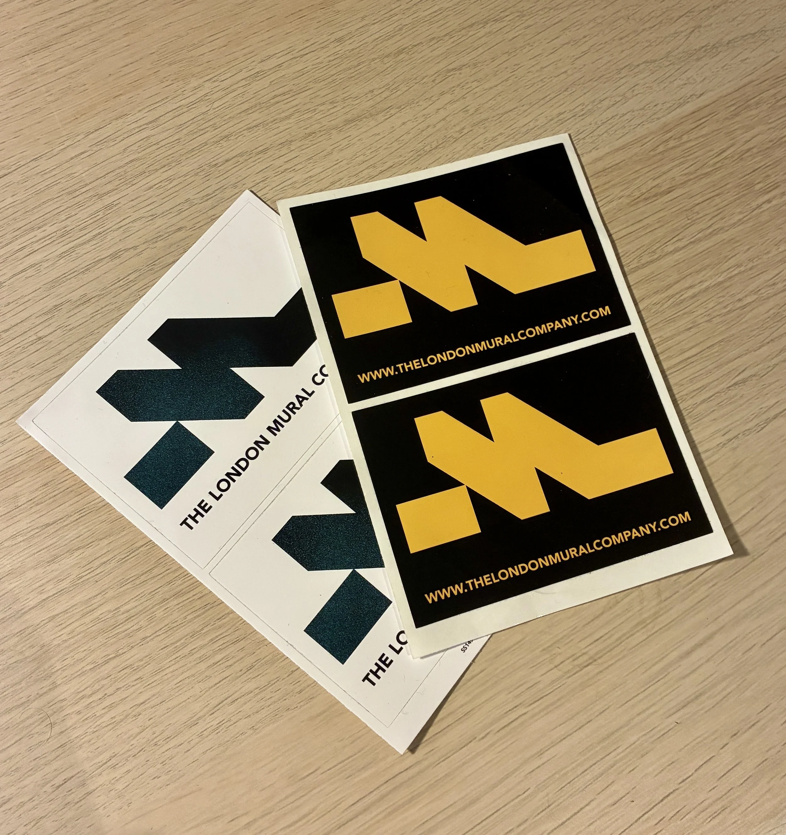
The result is a stripped-back, minimalist, brutalist “M”. Confident and highly adaptable, it’s designed to work across working sites, materials, workwear, and digital spaces - a functional graphic system as much as a logo.
This rebrand isn’t about changing who we are — it’s about acknowledging how far we’ve come and setting ourselves up for the next chapter. We’re proud of the past ten years, and even more excited about what’s ahead.